CONVERT COLOUR TO MONOCHROME
Since the advent of colour film
photographers have occasionally made monochrome prints from colour negatives or
colour transparencies. Although their first choice would always have been a print
from a mono negative, there were times when an image was captured in colour
without a mono film to hand.
The process of producing mono prints from colour negatives was quite
straightforward. They were simply printed on special darkroom paper or on a
darkroom multigrade paper. The adjustable contrast of the multigrade paper
produced monochrome prints of good tonal range and at times were
indistinguishable from those printed from black & white negatives.
In the case of colour transparencies things were a little more complicated. A
monochrome internegative was made, by rephotographing the transparency onto fine
grained film. The procedure of overexposing & under developing the negative was
the key to success. This was then printed in the darkroom onto normal monochrome
paper. If done correctly results could be very good.
With the advantages of digital imaging there is now a far better way of converting a colour image into monochrome. No matter how the picture was captured either by conventional film or by a digital camera it needs to be input to the PC & stored as an RGB digital file.
I work with Adobe Photoshop, however all the other digital imaging software has very similar tools for conversion. There are a number of ways of converting a colour file to monochrome.
The quickest method is the Grayscale
mode:
Image > Mode > Grayscale > OK
This removes all colour information & results vary with different images. The
biggest drawback is what you get is what you are stuck with. I would not
recommend this method.
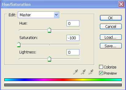
The second method is Saturation, or
more correctly de-saturation of the colour:
Image > Adjustments > Hue/Saturation. Move the Saturation slider from 0 to -100
then hit OK.
Results are very similar to taking a
picture with monochrome film without using filters.
Images tend to be rather flat & totally different original colours can appear as
the same shade of grey. This is another method that I would not recommend.
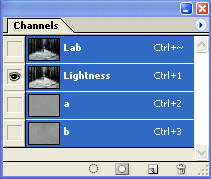
The third method and the best so far
is the use of Lab Colour:
Image > Mode > Lab Colour. In the Channels palette the colour information is
contained in the A and B channels & the lightness & mono values in the Lightness
channel.
Highlight the Lightness Channel & the image will appear as monochrome. Then go Image > Mode > Grayscale > OK and the file will be converted to monochrome.
A vast improvement on the previous two methods & although popular with some
photographers, what you get is what you are stuck with. It would not be my
chosen way of doing the conversion.
The final method is that using the Channel Mixer:
Image > Adjustments > Channel Mixer
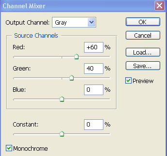
Tick the monochrome box. The channels
default to +100% Red, 0% Green & 0% Blue. Adjust the three sliders to change the
monochrome values of the image. All pictures vary; at times the 100% Red can be
a good option. However as a basic starting point set the channels to 60% Red,
40% Green & 0% Blue. Adjust the three channels until you are happy with the
image then hit OK. Try to get the overall balance to near 100% but this is not
absolutely essential.
This is in my opinion the best way of converting a colour file to monochrome.
An advanced technique, using this method, is to select different parts of the
image & apply the channel mixer selectively.
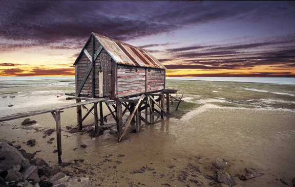
The Boathouse – Originally a colour
slide scanned into Photoshop, using a film scanner, and saved in RGB mode.
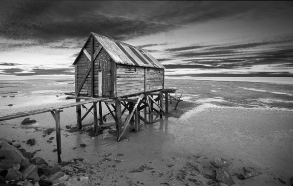
Three selections were made: one for
the boathouse, one for the sky & one for the beach. Each selection was
converted, separately, to monochrome using Channel Mixer. The following
adjustments were applied:
Boathouse Red Channel +116
Green Channel +2
Blue Channel 0
Sky Red Channel 0
Green Channel +54
Blue Channel +50
Beach Red Channel +68
Green Channel +52
Blue Channel 0
This allows ultimate control over the conversion & is akin to using different coloured filters to selected parts of an image. Taken to the nth degree one could have control over the density & tonal values of even the smallest element in an image, say for example a pebble on the beach. This amount of selective control could only be dreamt of in the darkroom.
When it comes to printing monochrome files I have found that heavyweight matt papers give the best results. Uncheck any High Speed printing facility in the printer software & use only the black ink set at the highest resolution that the paper will allow. This is usually 1440 DPI when using matt paper. Using only the black ink goes a long way towards removing unwanted colour casts although some inkjet papers can still display an unpleasant green cast. Choosing the “right” paper is essential in order to produce realistic darkroom quality mono prints.
Some of the fine art matt papers available today produce quite outstanding
results.